 So there I was, reading my e-mail the other day, when I received an upgrade notice from Thunderbird.
Great! Maybe they’ll fix things… So I upgraded.
Welcome to Thunderbird 78, where everything has changed!
Well, sort of…
My add-ons no longer worked, the folder pane was hideously black and white, I lost my CompactHeaders, and my message pane buttons were all screwed up. SIGH…
But, not to worry… Big things are in store for good old Tbird, and many of the annoying changes are easy to fix!
What happened to versions 69-77?
There aren’t any.
You see, in our modern era of a “new version” of software every 3 days, Mozilla decided to just skip from 68 directly to 78.
Why? God only knows. But don’t you feel better knowing that Thunderbird is now TEN versions newer?! 😛
What’s new?
Actually, a lot… You can read the Thunderbird 78 changelog here.
You really should check it out… There are a lot of new little features, as well as a few big ones – like:
- Settings is now it’s own searchable tab, like Firefox
- The Compose window is re-jiggered
- New address bar
- Support for end-to-end e-mail encryption
Okay, but what’s BAD about Thunderbird 78?
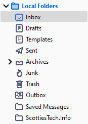
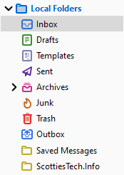
Oh, there are a few annoying changes. For example, look at how colorful things are now:
This is what it used to look like in v68:
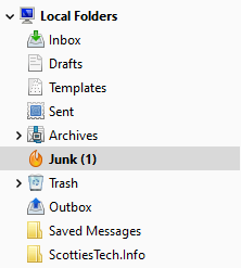
Yeah, that new black-n-white look is hideous. What’s worse, all your old add-ons don’t work any more.
That’s right! Mozilla is changing add-ons in Tbird AGAIN…
You can read more about Thunderbird add-ons here.
In short: We’ve gone from Overlay Extensions to Bootstrap Extensions to WebExtensions… and now (hopefully finally) we’re at MailExtensions.
Most likely, that means you’re favorite add-ons are hosed! Again.
Fortunately, as you’ll see below, the Tbird community is rapidly cranking out replacements – and in many cases, they work better than the old ones.
So all is not lost…
Whatever! How do I get my colored folder icons back?
Easy! You can now customize the color of each folder icon – one by one. It’s tedious, but it works.
First, pick the folder icon whose color you want to change – like the Junk folder.
Right-click the folder, and choose Properties. You’ll see this:
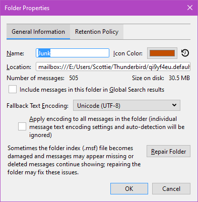
Click the colored box after Icon Color, and you’ll get a color picker:
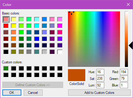
Note that if you want to make multiple folders the same color, you can choose a color and then click the Add to Custom Colors button to make your life easier!
After colorizing, my folder pane now looks like this:
Oh no! My Message Pane is ugly and huge again!
If the info bar in your message pane looks like this now:

You can fix it. I prefer a compact header, and buttons that have no text. I also insert spaces between the Junk and Delete buttons to prevent clicking the wrong one.
First, to fix the buttons, install the add-on Message Header Toolbar Customize.
With a little tweaking, your header bar in the Message Pane will look like this:

Almost there! Now, I was using the old add-on CompactHeader, but it’s no longer supported in Thunderbird 78.
Fortunately, just a few days ago, I discovered Compact Headers. Install that, and BOOM:
But, but… What about my other add-ons?
Be patient!
Many of them are already almost compatible with the new MailExtension add-on.
I’m guessing that many of the most popular add-ons will see new versions released quite soon.
So, keep an eye out, and don’t fret!
And finally… Thunderbird is gonna get WAY better!
Don’t faint!
If you’re a Thunderbird fan and you’ve been lamenting the slow development pace, hold on to your hat!
You might want to check out the Thunderbird 78+ Roadmap.
Some REALLY cool things are in the works…
- An all-new, modern Address Book
- Tons of speed improvements
- Switch from mbox -> maildir for storing e-mails (YAY!)
- Better message indexing + search
- Responsive Layout
- Folder Pane improvements
- Calendar improvements
- Better support for mailing lists
- And much more!
So, while change may be painful, it appears that Thunderbird isn’t going anywhere anytime soon – despite everyone else’s love of webmail.
In fact, this is all part of big changes with the Thunderbird development team, as well:
There was a time when Thunderbird’s future was uncertain, and it was unclear what was going to happen to the project after it was decided Mozilla Corporation would no longer support it. But in recent years donations from Thunderbird users have allowed the project to grow and flourish organically within the Mozilla Foundation. Now, to ensure future operational success, following months of planning, we are forging a new path forward. Moving to MZLA Technologies Corporation will not only allow the Thunderbird project more flexibility and agility, but will also allow us to explore offering our users products and services that were not possible under the Mozilla Foundation. The move will allow the project to collect revenue through partnerships and non-charitable donations, which in turn can be used to cover the costs of new products and services.
Thunderbird’s focus isn’t going to change. We remain committed to creating amazing, open source technology focused on open standards, user privacy, and productive communication. The Thunderbird Council continues to steward the project, and the team guiding Thunderbird’s development remains the same.
And that IS good news for those of us who prefer not to store our e-mail in Google’s all-seeing eye…
Stay tuned for more Thunderbird news!



Really getting frustrated with Thunderbird. The new folder icons are junkyard dog ugly, don’t care if you /can/ color them. Previous icons were easy to spot.
The constant breaking of plug-ins is maddening.
It’s great that the foundation is fixing things under the hood that need updating and adding features, but the messing with the UI seems gratuitous — let’s change it for change sake. I know a certain Redmond WA company guilty of that and it’s alienating people massively.
I know, it’s seriously annoying. On the other hand, I’m amazed (and quite happy) that at least SOMEBODY is trying to make a better mail client. Everyone and their dog uses Gmail via the web. So, good mail clients are a dying breed.
Well, I guess we’ll see where they take Tbird in the months to come…
I just spent an hour trying to make layout vertical again. so message preview is on right, not bottom. Did not find how… Any ideas???
Press the Alt key. In the titlebar at the top of the Tbird window, click: View -> Layout -> Vertical view.
That worked for me!
Thanks, Scottie, for the tips and workarounds. I updated to 78 to save me having to look at the flashing icon in the toolbar making me always think something detrimental has happened. I really appreciate all the work is being done under the bonnet. And I’ve finally sorted out all my Yahoo accounts so they play nicely. But, the UI is dire – it’s the equivalent of the dreaded brown envelope that drops though your letterbox – you don’t wanna see it, hide it, put off opening it for as long as possible. Maybe some kind soul will create a nice colourful theme add-on.
Yeap, agree: I don’t see how it could be any uglier, and *every* one of my add-ons is broken. What was wrong with the old way of doing add-ons? I tried to revert to 68, but 78 had already munged my profile, so I was Out Of Luck. (Why don’t they back up your profile before changing it?)
I tried the Compact Headers plugin, but I’ve toggled it on and off, and afaict it makes no difference (I have TB 78.4.0).
For Compact Headers, if you click the downward pointing >, it should shrink the headers. That’s what it does for me anyway – also on Tbird latest.
How did it decide what colors to use for my huge array of folders? They’re all either white or light blue on a black background. (I’m using dark theme.) But I don’t see a pattern to the choice. Account names are also randomly blue or white. What does that mean? I create new folders all the time. (Like separate folders for each sender.) How does it decide what color a new folder should be?
I dunno because they were all the same color for me!
Ok, it gets weirder. If I browse from folder to folder by clicking on the various blue and white folder names, they switch to white. So I think the blue mean unread mail, but it’s not consistent. And I think the blue actually means unread mail and unvisited folder. If I click on a blue folder and view the list of unread messages, then click on another folder, the first folder turns white. I think the intent is that blue is a highlight color (in dark theme) to indicate unread mail but googling suggests that there are some unpleasant interactions between the Win10 system dark mode and Tbird’s dark mode. The complaints involve the compose window’s background color but perhaps something similar is going on with the folder highlighting code.
Thunderbird needs to go back to a SOLID folder Icon, Instead of just the outline of a folder, or at least give the option to have a SOLID folder icon!
The new look is hideous. The color outlines are much harder to spot than the solid colored folder. One site said they needed to switch to SVG files for scalability, however, couldn’t they have just used a gilden outline with a gilden fill, so it doesn’t screw everybody up? Or if they are obsessed with change, give the users a choice. Just because some guys likes black and white, doesn’t mean everyone else does. People are very particular, and different about the colors they like. Messing with that just shows they don’t understand human nature (so maybe they shouldn’t mess with it).
Bottom line: we just reverted back to version 68, and we are staying there until they get some common sense and either put the default folders colors and look back, or at least let each user customize them the way they want – color is very important to each of us, and most people don’t appreciate being dictated to.
I stopped updating TB when they started messing with the addons etc. years ago.
If I find another half decent (non MS) client, I shall be changing to it.
I Changed colours on folders exactly as you explained
but they keep going back to default after starting a new session.
Modify the text size in Thunderbird. From the top you go to Tools> Options> scroll all the way down on the right side and click on “Config Editor”
File name is the same too: userChrome.css
C:\Users\ “your name” \AppData\Roaming\Thunderbird\Profiles\”Your profile name” 736m2uer.default-release\Chrome
You create a folder and call it Chrome and copy the userChrome.css file to it.
In the search box above the list, type or paste:
userprof
Double-click the: toolkit.legacyUserProfileCustomizations.stylesheets
Change preference from false to true. Close Thunderbird then re-open.
Here is the userChrome.css contents:
@namespace url(“http://www.mozilla.org/keymaster/gatekeeper/there.is.only.xul”);
/* set default namespace to XUL */
/* horizontal grid lines */
threadTree treechildren::-moz-tree-row() {
border-bottom: 1px dotted grey !important;
}
/* vertical grid lines */
threadTree treechildren::-moz-tree-column() {
border-right: 1px dotted grey !important;
}
/*
Make all the default font sizes 15px:
*/
{ font-size: 15px !important; }
In addition to the number of new/unread messages I have (Love that feature) how can I also see how many messages are in a folder?
The Total is shown at the bottom right of the Tbird window and changes depending on which folder you have selected.
Thunderbird email program – userChrome.css file how to.
http://www.davidshelpsite.com/firefox/firefox_tabs.html
Phoenity Icons 3.0b8 – Brings back colorful icons.
https://addons.thunderbird.net/en-US/thunderbird/addon/phoenity-icons
Updated link with walkthru:
http://davidswebsite.com/Firefox_tabs/firefox_tabs.html
The Phoenity Icons 3.0b8 do not work in TB 89b4 (nightly).
Ack!
I hate the look of the default Thunderbird.
I have the latest version 78.10.1
I will stop updating till Phoenity Icons is itself updated.
Version 3.0b8 Info
Last Updated: Nov. 21, 2020
They removed the option to add message counts to the folder pane from the “pretty” Options tab. So you have to use the config editor (bottom right of General options) to enable it. Search for mail.folderpane.showColumns and set the boolean to true. This adds a small control at the right of the folder pane header to select which headers to show.
By updating to TB78 ALL my mail and ALL the adress book were lost.
Also, you cant use multiple cc and bcc sending.
I had to reinstall TB 68, minus the whole mail store…….
Your mail is probably still there… For some reason, TB most likely decided to create a new profile instead of keeping the one you had.
The simple method to fix it is:
1. Close Thunderbird
2. Hold down Shift key on keyboard, and click Thunderbird icon to load it again
3. You should get ‘Safe Mode’ Tbird, which should give you a popup window that lets you choose a different profile
4. If you see a 2nd profile, click that and start Tbird with that profile
5. If your mail is back, repeat the process and tell it to use that other profile as the default one
If that doesn’t work, then you have to investigate… Your profiles are stored in:
C:\Users\YOUR_WINDOWS_USERNAME\AppData\Roaming\Thunderbird\
Note that in order to see the AppData folder and its subfolders, you need to click ‘Hidden items’ in the ‘View’ tab in Windows’ file Explorer.
In the above folder, you should see a Profiles folder and a file called profiles.ini.
Inside the Profiles folder, you’ll see 1 or more folders with a name like ‘sidfhoehwe.default’ or ‘fei3hsjas’. Those are the profiles.
The file profiles.ini contains a pointer to which profile to use.
You can figure out which folder in Profiles contains all your mail by right-clicking each one, and choosing properties. The hugemongous one is probably the profile where all your mail is hiding.
Take note of that profile name, and edit the profiles.ini file with a text editor (make sure Tbird is closed).
Under the profile that has ‘Default=1’, change the Path= variable to be the full path to your old profile, like so:
IsRelative=0Path=C:\Users\YOUR_WINDOWS_USERNAME\AppData\Roaming\Thunderbird\Profiles\fei3hsjas
Default=1
Save the profiles.ini and close it. Then try to fire up Tbird again, and it should have all your mail and settings back.
In TB 78 supposedly you can change folder colors… I go to properties and change it, but it never changes. It shows in properties as Pink or whatever color I’ve chosen, but doesn’t actually show as that color. What’s the point of a feature that doesn’t work when the add-on I had before did it perfectly?
I agree, the look of Thunderbird for Linux is terrible. I tried going back to the version 68 & ended up losing all my address books and entire calendar. I had a 2 week old backup so I was able to fix most of it. ow it is gone as well.
I version 68, I used Calendar Tweaks. I was able to color each appointment & make it easier to view them. Now, it is much harder to view things. I was thinking of donating to them, but not until they correct everything they screwed up.
Yes, what a mess.
Most everything is in tabs. That’s fine for some things, but not a combined Mail Reader and Calendar. What’s up with calling that “events and tasks?” I had a hard time even FINDING the calendar or how to open it. How about calling it “Calendar and to-do” or something. (I’m old-fashioned I guess.)
Hard to find anything or how to do it.
Calendar view configurations in two or three separate places, and it’s very easy to click something and have no idea how to put it back the way you wanted it.
Thunderbird reborn?
This has to be the best marketing campaign for other email clients.
After many, many hours of research, my TB installation is back to 68 with everything back the way I like it.
The devs need to wake up to the fact that addons are what attracts users. Break the addons, break the users.
Thanks for all the info above, particularly about the ugly monochrome icon fix!
Here is an FYI you and your readers may be interested in:
According to:
https://www.ghacks.net/2020/12/07/you-need-to-use-a-master-password-in-thunderbird-if-you-use-openpgp/
“The development team may introduce support for protecting OpenPGP keys using user defined passwords instead of the single randomly generated password. A bug is already available but it is unclear whether the change will be introduced or if it won’t be implemented.”
“Thunderbird users who use the built-in OpenPGP functionality may want to enable master password functionality to protect Thunderbird data against unauthorized access. Mozilla should consider informing users about the fact during the initial setup or import.”
Also, in the Write window, there are no buttons for quickly selecting Encrypt (or not) or Digitally Sign (or not). You have to go to the Options menu, or the Security drop-down to view or change these settings. This is a real nuisance (and I am being very polite, here).
The Master Password is only used once, when Tbird opens up for the first time. There does not seem to be any time-out for the password, like there was for the individual (per account) passwords in Enigmail. So once Tbird is open, as long as the computer remains unlocked, anyone can impersonate you and send bogus emails with your signature on them. The new system may be more convenient, but Tbird has really taken several big steps backwards as far as security goes in this area.
Hi, I’m new to Thunderbird having just recently ditched Outlook after decades. Thunderbird is really great and I am glad I made the switch. However, I am having an annoying problem where the background of the application is transparent. It seems like this issue first became a problem back in 2011. At that time there were workarounds (compatibility mode, and the NoGlass add-on) but those options don’t fix the issue in the current version 78.11.0. How is it possible after 10 years this problem is not simply resolved, perhaps by a switch to turn off glass mode inside Thunderbird itself? Do you have any suggestions? I want to stay with Thunderbird, but if I am going to be stuck not being able to see the application window it seems like an uninstall is inevitable. Thanks for any help you can offer.
What version of Windows are you using?
I use TB from 2000 and still want to use it. But every broken add-on make me crazy. This time (I upgraded to 78) NoGlass, which I used because of coloured icons for example. Why everything is now grey on grey??? Stupid direction! I not found any setting for this, from years, and now situation is worse – less and less addons are compatible.
It’s customary to screw everything up – the newer the software gets “fiercer” – unfortunately many programmers don’t realize that changes can be made not in appearance but in content and engine. The time and work of the people who have adapted for themselves over the years is also worth something, and most of them do not want to go with everyone’s wet dreams.