 Okay, I know this one has been done like 8 bazillion times, but this method of creating a drop shadow on elements in a web page via CSS and a 1 pixel by 1 pixel transparent PNG file actually DOES work.
You see, I tried all kinds of different methods of creating drop shadows in CSS, both with and without an image file, and there was always a problem. It would render properly in certain browsers. It would render properly, but it only worked for fixed-width elements on the page. Or, maybe it would only render properly for variable width page elements. Or, the darn thing just didn’t work at all.
Well, I got tired of all of that, so I decided to make my own version of the CSS drop shadow. It may not be the prettiest, but it works.
First of all, my method does use a 1px by 1px PNG file as the drop shadow background. Quite frankly, I’m not sure why everyone tries to do drop shadows in CSS only. I mean, for the love of Pete, web browsers display images. Not only that, but the image can be tiled in the CSS, so it’s frickin’ tiny!
Now that that’s out of the way, let’s get down to business.
The scheme works like this:
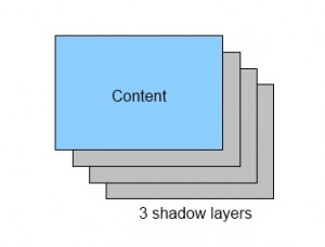
 There is a DIV with content in it. Underneath that are 3 or more shadow layers. The very bottom layer is special in that it is the “anchor” layer. The drop shadow layers on top of it are each offset up and left by 1 pixel from the preceding layer. Finally, you have the blue content layer, which is also offset up and left by 1 pixel.
The end result is a nice effect that looks like this:
 Isn’t that nice? Of course it is. Okay, so it isn’t exactly the prettiest drop shadow artistically speaking. But sometimes, we don’t need a really nice shadow; we just want to lift elements off the page a big and make them a bit more 3D. Of course, you can also play around and add more shadow layers depending on the size of the content layer.
Anyway, here’s how it’s done:
<html xmlns="http://www.w3.org/1999/xhtml" xml:lang="en" lang="en">
<head>
<meta http-equiv="Content-Type" content="text/html; charset=UTF-8" />
<title>Scottie's Simple Drop Shadow</title>
<style type="text/css">
  body {
    background-color: #fff;
  }
  #bg {
    background: url("dropshadow.png") repeat scroll 0 0 transparent;
    width: 25%;
    margin: 75px auto 0 auto;
  }
  .bg2 {
    background: url("dropshadow.png") repeat scroll 0 0 transparent;
    position: relative;
    bottom: 1px;
    right: 1px;
  }
  #content {
    background-color: #8CCFFF;
    position: relative;
    bottom: 1px;
    right: 1px;
    text-align: center;
    padding: 50px;
  }
</style>
</head>
<body>
<div id="bg">
  <div class="bg2">
    <div class="bg2">
      <div class="bg2">
        <div class="bg2">
          <div class="bg2">
            <div id="content">
              <p>This is the content!</p>
            </div>
          </div>
        </div>
      </div>
    </div>
  </div>
</div>
</body>
</html>
You can see that this is pretty simple. There is a bottom layer with id “bg” that has a width of 25%, and the background is our transparent, single-pixel PNG file that is repeated in the X and Y directions, giving a nice solid transparent grey background color.
Inside “bg” are a bunch of nested DIVs with class “bg2”. These “bg2” DIVs have the same background image file as the base “bg” div. Each of these DIVs is shifted up and left by 1 pixel using “bottom: 1px; right: 1px;”
Finally, we have the DIV with id = “content”. This is the DIV that is supposed to look like it has the dropshadow. It is also shifted up and left just like the “bg2” DIVs.
To see the SuperDuper CSS Drop Shadow in action, click here.
To download the PNG file so you don’t have to make your own, click here.
You’ll notice that the PNG file is a whopping 144 bytes. I know, I know: I SO should have done it in CSS only! I mean, cripes, all that extra bandwidth for that one little PNG file is gonna crash my server!
But seriously, click the “drop shadow in action” link above, and resize your browser window. As you can see, the drop shadow is resized along with the content. Of course, you don’t have to use it this way. You can set your DIVs to have fixed heights and widths, and it will work just fine – unless you’re really bad with CSS, in which case it won’t work at all. I have tried this scheme with both variable and fixed-width DIVs, and it works.
But wait! There’s more! I also tried it with relative and absolute positioning on the page, and it works. Then I tried it standing on my head, and it works. Underwater? It works.
This technique has been tested in all major current browsers, as well as some older ones such as Firefox 2.0, IE7, and even IE6. Yes, it even works in IE6, although you need to use something like Unit Interactive’s Unit PNG Fix JavaScript file since IE6 doesn’t do transparency in PNG files. This fix is a 1.1kB JavaScript file that will make IE6 happy with transparent PNGs so that they don’t show up as drab, solid grey blobs. Again, it ain’t gonna kill your bandwidth.
So, sure, you could go out there and keep trying those other Brand X drop shadow schemes if you enjoy driving yourself mad. Or you could just use this technique, be happy, and still have time left over to watch The Rent is Too Damn High for the 500th time.


Recent Comments