 Here’s a fun one: You’ve got something like an icon image, and you want to insert it into your web page using JavaScript.
Easy, right? Well, maybe not…
What if you need to know the size of the <IMG> before you plop it in the DOM tree, but you also have @media queries in CSS that change the width on the fly, for example?
Maybe your CSS shrinks or expands the image based on device orientation, screen size, etc.
Can it be done? Why yes, it can!
What the heck?!
Now I know this may sound weird, but I recently had exactly this problem with Google Maps.
You can use your own PNG images as map marker elements. All well and good so far…
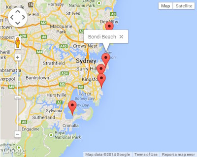 You look at the map on desktop, and your markers look good. You then check out the map on a smartphone, and we’ve got a problem.
In landscape orientation, the PNG markers are a bit small. But rotate the screen so it’s in portrait mode, and OH! That’s not good… The markers are TEENY-TINY!!
CSS @media queries to the rescue! This lets us use a larger map marker PNG (maybe 64×64 pixels), and then downsize it to 40×40 on desktop, 56×56 on high-res desktops, 40×40 on mobile + landscape, and 64×64 on mobile + portrait. Cool!
The trouble comes when your JS is iterating over map markers and about to draw them on the map. In order to space out markers at the same location, you must know the pixel dimensions of each marker. But you can’t know the pixel dimensions of the markers until they’re inserted in the DOM, and THEN the CSS takes over and resizes them!
You may have encountered a similar problem where you need to know something style-related about an HTML element generated by your JS, but there’s no way to do window.getComputedStyle() until the element is actually rendered. D’OH.
Okay, now you understand the problem. Here’s the solution:
The Solution
The key is to insert the <IMG> tag in the page, but so that we can’t see it. This means the <IMG> marker will be invisible to the end user, but the Laws of CSS (including @media queries) will apply. Then, we just measure whatever we want, and delete the ‘invisible’ element when done.
Like so:
// Get the width of an IMG, including with CSS rules applied
var tmp = document.createElement('img'), thewidth;
tmp.src = '/images/markers/marker_1.png';
tmp.className = 'my_img';
tmp.style.visibility = 'hidden';
tmp.style.position = 'absolute';
document.body.appendChild(tmp);
thewidth = tmp.width;
tmp.parentNode.removeChild(tmp);
All we’re doing is creating an <IMG> tag, setting its SRC attribute to our 64×64 marker PNG, adding the class ‘my_img’ which is used to size the image up or down, setting the <IMG> to hidden and position: ‘absolute’, and then appending it to the <BODY>.
The user won’t see it, but the CSS is applied, and so we can now measure the width: 40.
Finally, we remove the <IMG> tag from the DOM, and we’re done. Now we can use the value in thewidth to do whatever we need!
The same applies to height or any other computed style of an <IMG> tag, <DIV>, or any other HTML elements you can think of.
Just keep in mind that if your <IMG> normally renders inside another <DIV> that influences its layout, you may need to create an identical dummy <DIV> and then append your <IMG> tag inside that in order to get a proper measurement. It just depends on how you laid out your HTML and CSS.
Bonus: Run a chunk of JS on the fly
Ever wonder how jQuery or my own library PikaJS can run chunks of JavaScript code on the fly?
It uses a very similar technique:
// Run some chunk of JavaScript
var js = document.createElement('script');
js.text = "YOUR JS CODE GOES HERE";
document.head.appendChild(js).parentNode.removeChild(js);
Yup, that’s it. All we’re doing is creating a <SCRIPT> tag, plopping our JS inside it, appending the <SCRIPT> tag as the last child of the <HEAD> tag of our webpage – which causes the browser to execute the JS code immediately – and then removing the <SCRIPT> tag. DONE!
Well, there you have it. Hope that helps somebody!

Recent Comments